Math Unit 8
In this unit, we are focusing on visualizing categorical data using pie charts and even better, bar graphs. I will be using ggplot and highcharter to visualize the data.
library(tidyverse)
library(highcharter)
library(ggplot2)
Create and view my data
#Problem 7-8
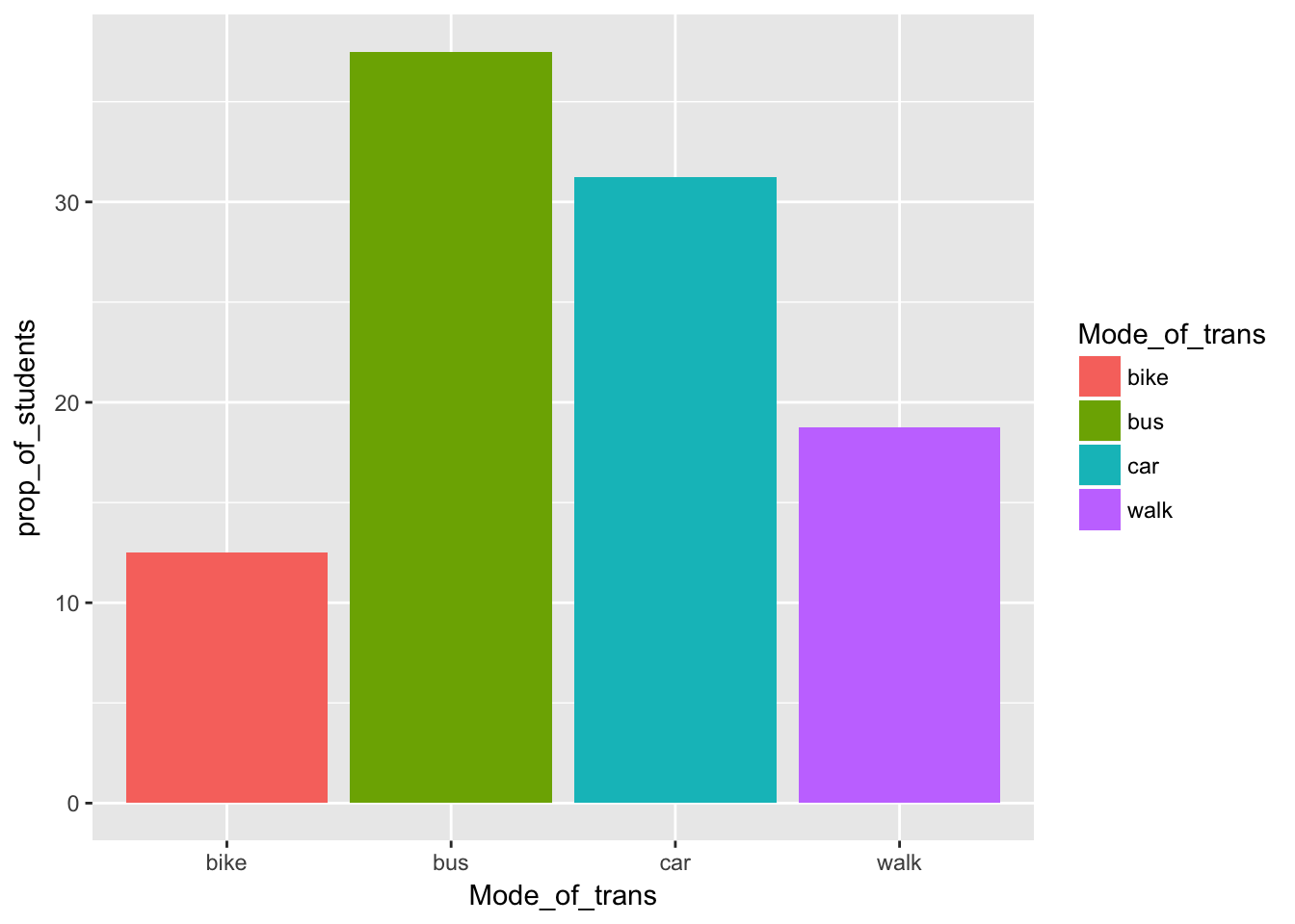
Mode_of_trans <- c("bus", "bike", "car", "walk")
Num_of_Students <- c(90, 30, 75, 45)
Survey_Data = tibble(Mode_of_trans, Num_of_Students)
#Now I'm going to calculate the proportion using dplyr verbs
Prop_survey_data <- Survey_Data %>% mutate(prop_of_students = (Num_of_Students/sum(Num_of_Students))*100)
Prop_survey_data## # A tibble: 4 × 3
## Mode_of_trans Num_of_Students prop_of_students
## <chr> <dbl> <dbl>
## 1 bus 90 37.50
## 2 bike 30 12.50
## 3 car 75 31.25
## 4 walk 45 18.75Now I’ll use highcharter to create a pie chart
highchart() %>%
 hc_add_series(Prop_survey_data, "pie", hcaes(name = Mode_of_trans, y = prop_of_students), name = "% of Trans", dataLabels = list(enabled = TRUE, format = '{point.name}: {point.y}%')) %>%
 hc_add_theme(hc_theme_ffx())
Highcharter to create a bar graph
# highchart() %>%
#  hc_add_series(Prop_survey_data, "column", hcaes(x = Mode_of_trans, y = prop_of_students), name = "% of trans", dataLabels = list(enabled = TRUE, format = '{point.y}%')) %>%
#  hc_add_theme(hc_theme_538())

hchart(Prop_survey_data, "column", hcaes(x = Mode_of_trans, y = prop_of_students), name = "%n of trans", dataLabels = list(enabled = TRUE, format = '{point.y}%')) %>%
  hc_add_theme(hc_theme_538())
ggplot to create a bar graph
ggplot(Prop_survey_data, aes(x = Mode_of_trans, y = prop_of_students, fill = Mode_of_trans)) + geom_bar(stat = "identity")